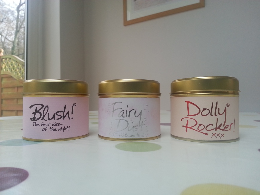
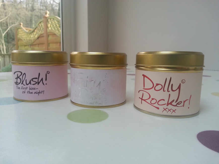
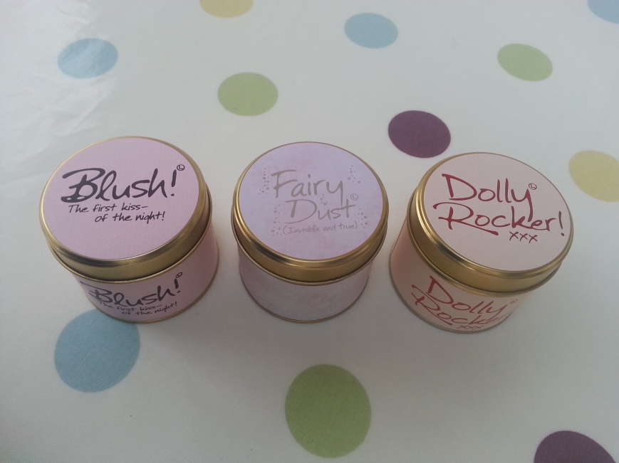
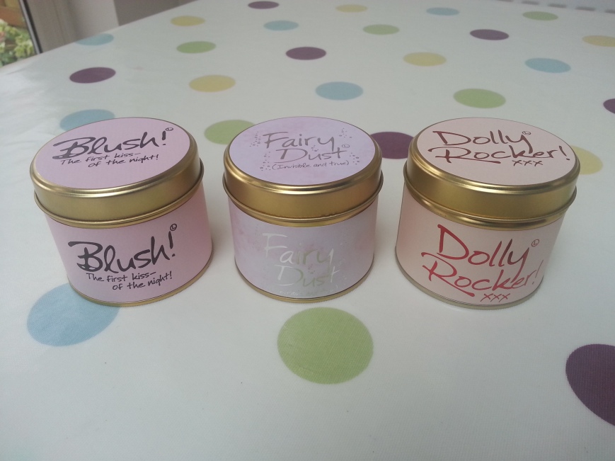
I’ve posted about the packaging of Lily-Flame Scented Tins before here. I attempted to find out which font they use. A friend asked for a candle for Christmas so I got her some. I took photos of the lovely packaging.
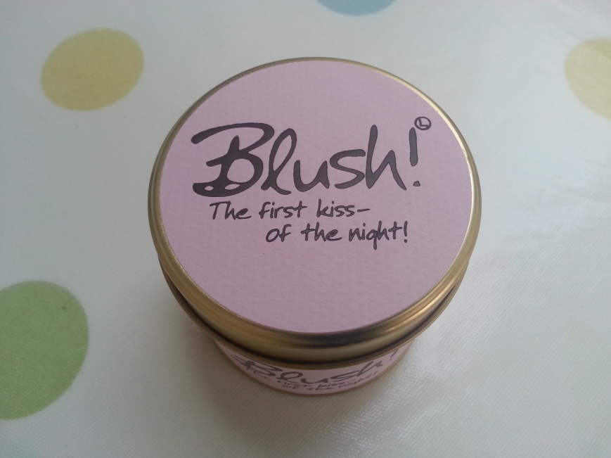
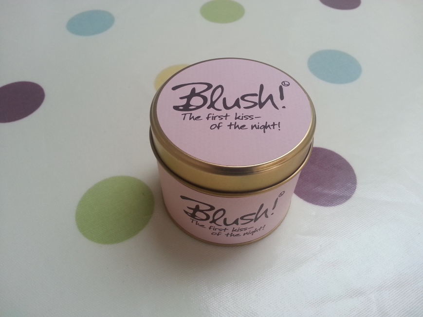
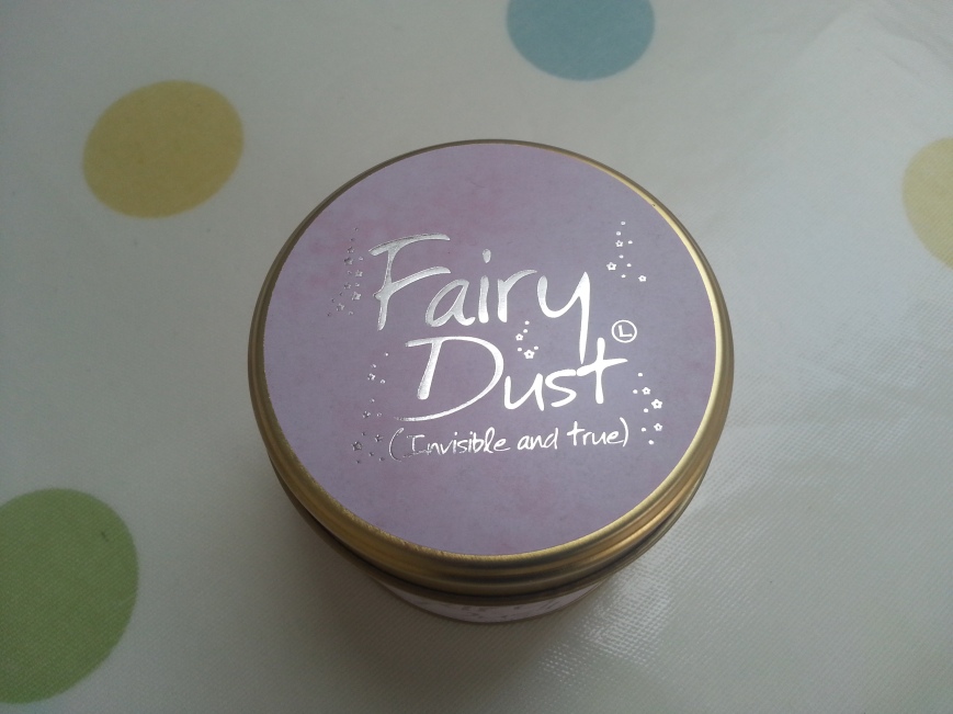
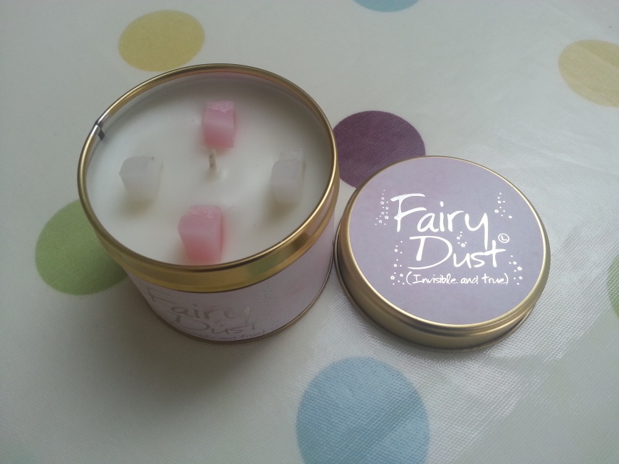
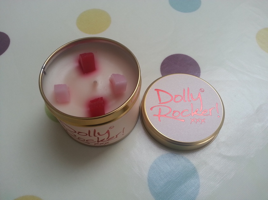
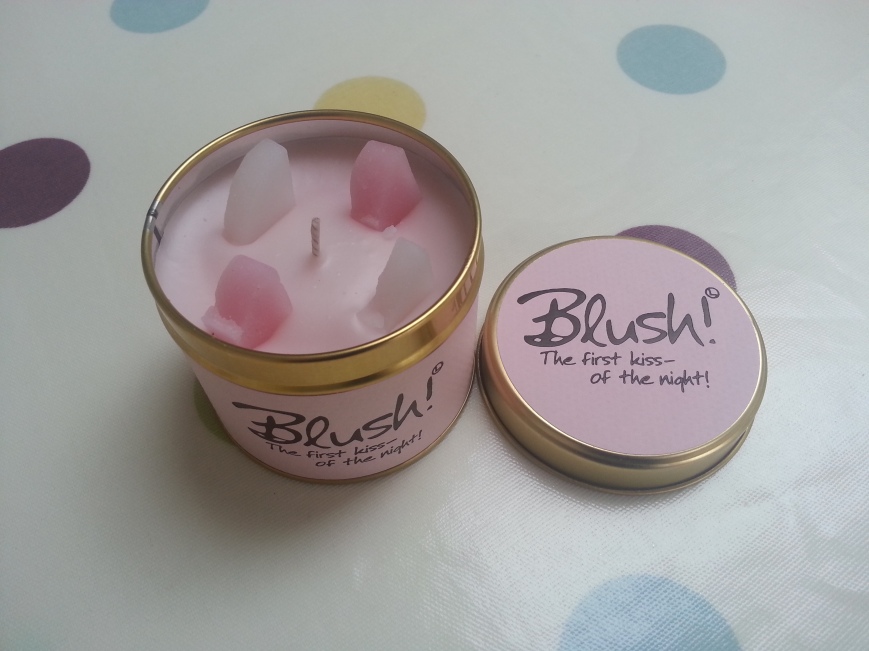
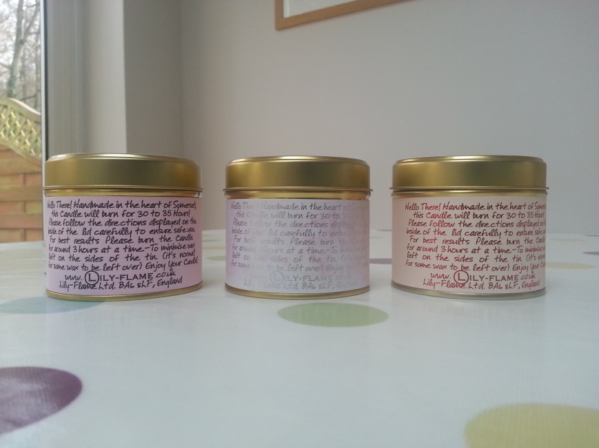
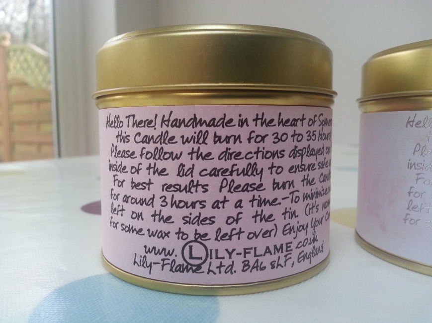
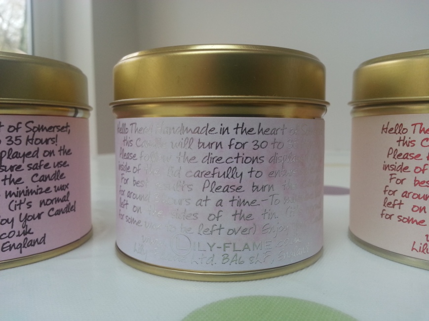
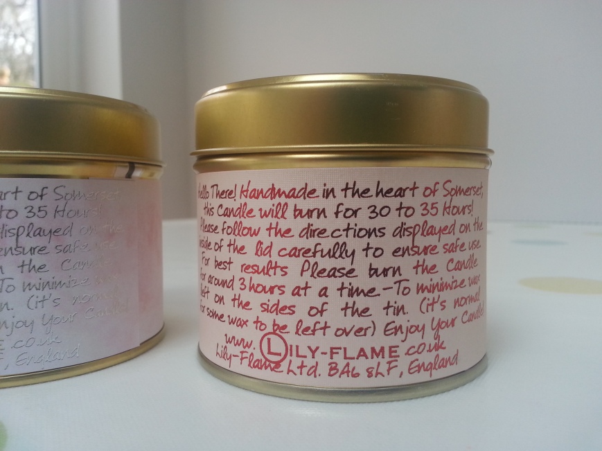
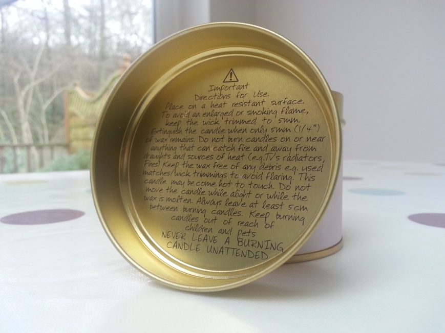

I’ve posted about the packaging of Lily-Flame Scented Tins before here. I attempted to find out which font they use. A friend asked for a candle for Christmas so I got her some. I took photos of the lovely packaging.
So my first idea was to set out the home page to emulate one I had identified in my research.

http://jeremylarsonmusic.com/
Here you can see I have left a space for the content. As you can see below, there isn’t much room so I abandoned my initial idea and decided to have just a slider. Keep it nice, clean and simple.

In class I asked for feedback from the tutor. I showed all the different options for the placement of the type so I could decide which one was the best.


From all the feedback and from my own considerations, this is the final choice.

Options shown in class:

From all the feedback and from my own considerations, this is the final choice.

Options shown in class:


From all the feedback and from my own considerations, this is the final choice.

I hope this post illustrates everything I’ve been learning. I’ve been listening to my tutor and my fellow students and acting on their feedback. You can see here how my process has brought me to the right choice in the placement of the type for the slider.
Flickr: SN_Studio’s Photostream.
I like how when I hover over an image a little transparent box appears. In the box there is a caption and the name of the account. On the right there are options to favourite, comment and zoom. I think this is really good.
 https://www.flickr.com/photos/sn_studio/
I’m not sure yet if this would be needed on my site but I think its a neat and intelligent way of making the site interactive. By having all the options appear like this, it doesn’t ruin the nice clean, simple photo album layout. Well done flickr.
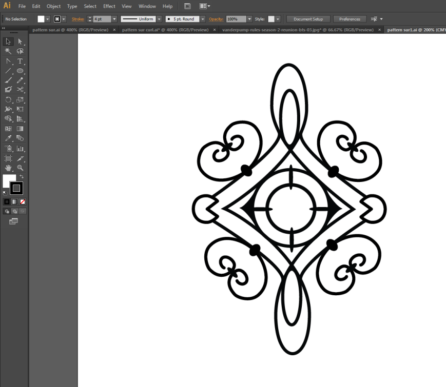
I was watching Vanderpump Rules which is a TV show about a restaurant in West Hollywood called Sur. It’s a very stylish place full of vintage pieces, freshly cut flowers, candles and atmospheric lighting.

http://ciaonewportbeach.blogspot.co.uk/2012/06/inside-sur-lounge.html

http://s3-media2.ak.yelpcdn.com/bphoto/UKD31Cj0jtZCbcs3KEFw0A/l.jpg

http://ciaonewportbeach.blogspot.co.uk/2012/06/inside-sur-lounge.html

http://hollywoodclubguestlist.com/wp-content/uploads/2012/07/09IMG_1562.jpg
I really like the pattern in the background of this picture.

http://www.bravotv.com/media/images/persons/vanderpump-rules-season-2-reunion-bts-03.jpg
Here I am using the picture behind to draw over using the pen tool.

Here is a different view. I’m using the pen tool again.

http://www.bravotv.com/vanderpump-rules/season-2/photos/behind-the-scenes-at-the-pumprules-reunion#image-185182


Here is the finished design. I’m happy with it. I don’t know if it will be useful yet. It’s a start.
I was glancing over Stassi Schroeder’s instagram and saw this. Stassi is a fashion writer and reality TV star. It’s actually the background I’m interested in here! This paint design isn’t appropriate for my current project. It’s just a nice, colourful piece of inspiration. It would be easy to make something like this in Photoshop or Illustrator, including the transparent part on the right.

http://instagram.com/p/khxnQLKKTC/
Today I went to see these two exhibitions with a fellow student. We had a really good day! First stop Wagamama near London Charing Cross. I ordered prawn kare lomen which I saw on the internet here:  http://www.wagamama.com/our-menu/prawn-kare-lomen
Here it is: 
My friend got chicken ramen: 
I went to see Wildlife Photographer of the Year 2012 and 2011. There were some really good pictures this year. http://www.nhm.ac.uk/visit-us/wpy/index.html
This one reminded me of the turtles in Finding Nemo.  http://www.nhm.ac.uk/visit-us/wpy/gallery/2013/images/behaviour-cold-blooded-animals/4751/dive-buddy.html
This was my favourite. I love the colours.  http://www.nhm.ac.uk/visit-us/wpy/gallery/2013/images/wildscapes/4801/ice-aurora.html
This was my friends favourite picture.  http://metrouk2.files.wordpress.com/2013/08/ay117029765polish-spring-sp.jpg
Then we went to the V&A to see the Jameel Prize 3. I didn’t think it would be that good but actually it was really good! http://www.vam.ac.uk/whatson/event/2866/the-jameel-prize-3-4235/
I took this video outside of the exhibition. Photography is not allowed inside.
 http://underculture.co.uk/wp-content/uploads/2013/12/photo-2.jpg
 http://www.vam.ac.uk/channel/images/content/video/full/1374571710.png
My friend and I thought these rugs were really cool.

http://www.wallpaper.com/galleryimages/17053828/gallery/8_Jameel_Prize.jpg
![]()
https://tfeanda.files.wordpress.com/2014/01/faig_ahmed_pixelate_tradition.jpg%3Fw%3D187%26h%3D300
I was browsing the internet and accidentally came across the following article: ‘The Enchanted Woodland…on the outskirts of London: Gardens around Duke of Northumberland’s second home are lit up to create a magical winter trail for walkers‘ on the dailymail.co.uk
My reaction to these photos was ‘wooooooow this is exactly what I want to do!’ So I was very happy that I found an idea. I looked up how far away the gardens are and they are a three-hour train journey away. So that was a bit disappointing. I felt that was a bit too far. A relative suggested I go to the skating rink in the park in the centre of my town. I thought ‘Yes!! What a great idea!’


http://www.dailymail.co.uk/news/article-2512826/The-Enchanted-Woodland–outskirts-London-Gardens-Duke-Northumberlands-second-home-lit-create-magical-winter-trail-walkers.html
Conclusion
I love these pictures. They remind me of when I made my header design from photographs of my friends Christmas tree lights. I love all the colours and the way it looks quite mysterious. It was fortuitous that I saw this article. It will be interesting to see if I can get some good photos from the skating rink in the park.
The purpose of this post is purely to give the references as to where I got my photos and information from.

http://bryansides.com/wp-content/uploads/2012/09/northstar-1.jpg

http://firstlivestudio.files.wordpress.com/2012/08/ariel-studio.jpg

http://www.eddystone.org.uk/wp-content/uploads/2012/05/Colourful-Condoms-resize.jpg

http://finite-films.com/wp-content/uploads/2013/09/IMG_7339.jpg

http://www.lafilm.com/sites/default/files/casual-films-shoot.jpg

http://www.love-nutrition.com/wp-content/uploads/iStock_000008233795Medium-man4-908×1024.jpg

http://thumbs.dreamstime.com/z/middle-aged-business-man-suit-laptop-8082636.jpg
Leadership page information from:
http://www.therobblackshow.blogspot.co.uk/
http://www.blogtalkradio.com/latenightrobblack/2013/12/05/the-rob-black-show
http://en.wikipedia.org/wiki/Rob_Zicari
http://en.wikipedia.org/wiki/Extreme_Associates
http://en.wikipedia.org/wiki/Xtreme_Pro_Wrestling
http://en.wikipedia.org/wiki/Tom_Byron
I have used Wikipedia since the brief does not specify that the information must be factional. Indeed the brief specifies that some of it could be fictional.
I did some research and found out that the film studios for the adult industry are based in different locations. http://tinyurl.com/ydda544 I tried different photos at different stages through the project. I thought I would try this picture:

http://www.sixt.de/fileadmin/files/global/modules/branch/US/miami.jpg
I thought it would look great but when I tried it out in Muse, it didn’t work. The bottom of the picture was fine, as shown below but as soon as you scrolled up there was too much blank blue sky. Although there were no particularly problematic connotations, it still didn’t work well.

I really like this picture of Las Vegas but it is so flashy and eye-catching I decided to swap it with another one. I didn’t want people to think the site was about what Las Vegas is famous for i.e gambling, shows, hotels, clubs.

http://www.mrwallpaper.com/wallpapers/las-vegas-strip.jpg
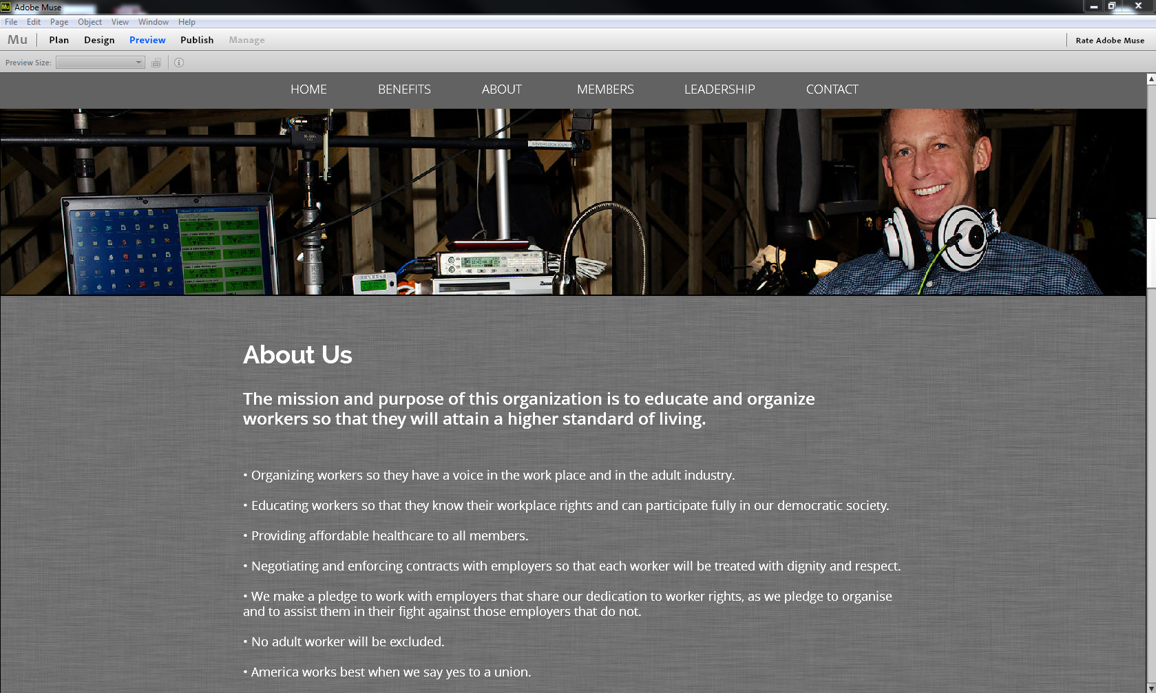
The tutor and I agreed that this picture did not have any particularly problematic connotations. I really like this picture but I decided to swap it with another. I made this decision after receiving feedback from the tutor about looking for photos with people in them. The tutor said that since the site is about a union it should have people in at least some of the photos.

http://www.mrwallpaper.com/wallpapers/Railway-Los-Angeles.jpg
I liked this photo but again there are no people in it and its meanings are too wide. This photo could be about a plethora of things; hiking, plants, weather or geology.

http://best-wallpaper.net/wallpaper/2560×1600/1211/Nevada-desert-rocks-mountains-red-rock-canyon_2560x1600.jpg
The other problem I noticed was that when only the bottom half of the photo was showing it just looked like a bunch of dried up, dying weeds. So the photo had to go.

Since the tutor and I wanted to see more people in the design, I put this picture in.

http://www.creativeplanetnetwork.com/the_wire/wp-content/uploads/2013/01/DKelson_Hi.jpg
I decided to swap this photo for another since I feel like the man in the picture might be mistaken for a representative or leader. I think it’s the fact that the man is making direct eye contact that gives off the wrong connotations. I don’t want the viewer to want to ask ‘who is that?‘ I need the pictures to be a bit more understated and anonymous so that the viewers can imagine that they want to join. I do not want to draw attention to this one individual.
A friend sent me this article to read. When I saw the picture I immediately realised that I could use a similar picture.

http://www.dailymail.co.uk/news/article-2519759/Porn-industry-shuts-AGAIN-star-tests-positive-HIV.html
I found this one. I’m glad I found it because it provides a pop of colour and its very relevant to the whole reason why I’m making this site. The connotations of this picture are safe sex which is the whole point of the union; to try to stop people catching HIV.

http://www.eddystone.org.uk/wp-content/uploads/2012/05/Colourful-Condoms-resize.jpg
Photos I Considered But Didn’t Use
I looked at a lot of photos. Here are a few I didn’t end up using.

http://farm8.staticflickr.com/7152/6509896313_0ca8240f23_o.jpg

http://www.jansphotoblog.de/wordpress/wp-content/uploads/2013/05/Studio-setup.jpg

http://www.creativeplanetnetwork.com/the_wire/wp-content/uploads/2012/10/SFarr_Hi.jpg

http://clerestoryproductionsblog.com/wp-content/uploads/2013/11/MG_3536.jpg
I took my website to college to get feedback from my fellow students and the tutors. Everyone agreed that this picture wasn’t really appropriate in that it looks like a tourist picture. The tutor thought it looked European and one student thought it looked like China.

http://farm6.staticflickr.com/5149/5627832853_252b40e295_o.jpg
The tutor said people may not understand what the food means so he advised me not to use this photo.

http://www.waegook-tom.com/wp-content/uploads/2013/08/DSC01054.jpg
I was worried the tutor wouldn’t like the jeans texture I made but he did so that was good. The tutor said I needed to think about the people and have some people in the photos. So I went home and looked for some new photos.


