
I did some research and found out that the film studios for the adult industry are based in different locations. http://tinyurl.com/ydda544 I tried different photos at different stages through the project. I thought I would try this picture:

http://www.sixt.de/fileadmin/files/global/modules/branch/US/miami.jpg
I thought it would look great but when I tried it out in Muse, it didn’t work. The bottom of the picture was fine, as shown below but as soon as you scrolled up there was too much blank blue sky. Although there were no particularly problematic connotations, it still didn’t work well.

I really like this picture of Las Vegas but it is so flashy and eye-catching I decided to swap it with another one. I didn’t want people to think the site was about what Las Vegas is famous for i.e gambling, shows, hotels, clubs.

http://www.mrwallpaper.com/wallpapers/las-vegas-strip.jpg
The tutor and I agreed that this picture did not have any particularly problematic connotations. I really like this picture but I decided to swap it with another. I made this decision after receiving feedback from the tutor about looking for photos with people in them. The tutor said that since the site is about a union it should have people in at least some of the photos.

http://www.mrwallpaper.com/wallpapers/Railway-Los-Angeles.jpg
I liked this photo but again there are no people in it and its meanings are too wide. This photo could be about a plethora of things; hiking, plants, weather or geology.

http://best-wallpaper.net/wallpaper/2560×1600/1211/Nevada-desert-rocks-mountains-red-rock-canyon_2560x1600.jpg
The other problem I noticed was that when only the bottom half of the photo was showing it just looked like a bunch of dried up, dying weeds. So the photo had to go.

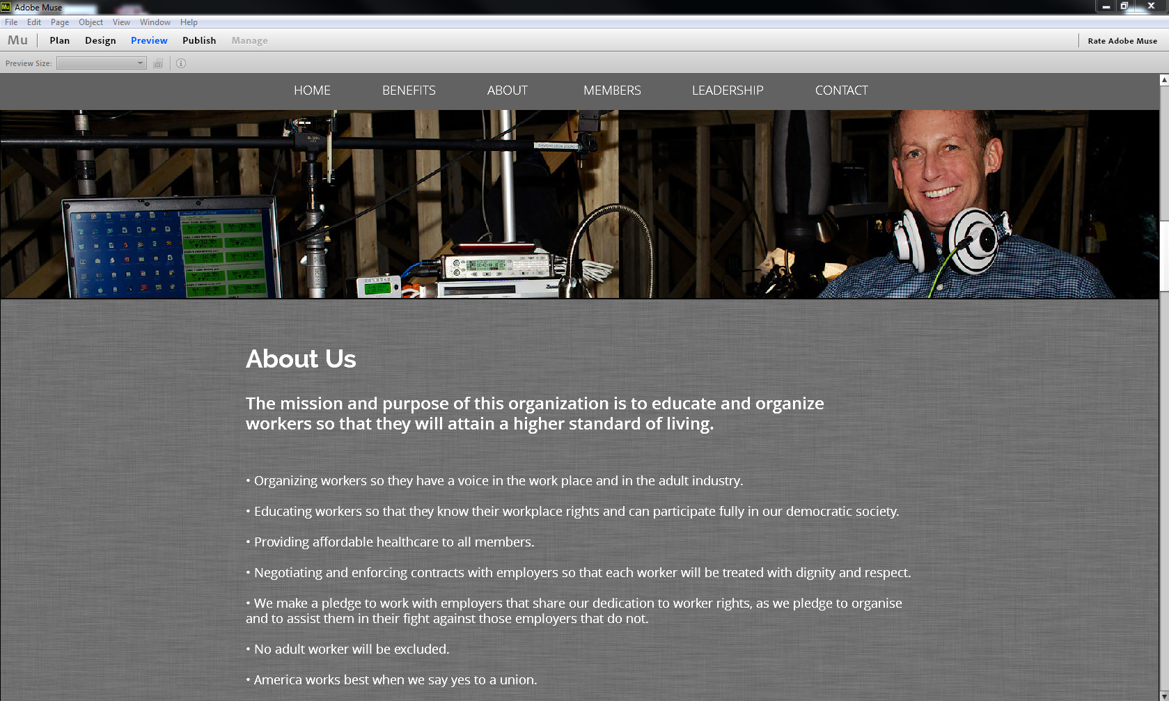
Since the tutor and I wanted to see more people in the design, I put this picture in.

http://www.creativeplanetnetwork.com/the_wire/wp-content/uploads/2013/01/DKelson_Hi.jpg
I decided to swap this photo for another since I feel like the man in the picture might be mistaken for a representative or leader. I think it’s the fact that the man is making direct eye contact that gives off the wrong connotations. I don’t want the viewer to want to ask ‘who is that?‘ I need the pictures to be a bit more understated and anonymous so that the viewers can imagine that they want to join. I do not want to draw attention to this one individual.
A friend sent me this article to read. When I saw the picture I immediately realised that I could use a similar picture.

http://www.dailymail.co.uk/news/article-2519759/Porn-industry-shuts-AGAIN-star-tests-positive-HIV.html
I found this one. I’m glad I found it because it provides a pop of colour and its very relevant to the whole reason why I’m making this site. The connotations of this picture are safe sex which is the whole point of the union; to try to stop people catching HIV.

http://www.eddystone.org.uk/wp-content/uploads/2012/05/Colourful-Condoms-resize.jpg
Photos I Considered But Didn’t Use
I looked at a lot of photos. Here are a few I didn’t end up using.

http://farm8.staticflickr.com/7152/6509896313_0ca8240f23_o.jpg

http://www.jansphotoblog.de/wordpress/wp-content/uploads/2013/05/Studio-setup.jpg

http://www.creativeplanetnetwork.com/the_wire/wp-content/uploads/2012/10/SFarr_Hi.jpg


http://clerestoryproductionsblog.com/wp-content/uploads/2013/11/MG_3536.jpg


