
So I was looking at the beautiful and affordable accessories at shopprimadonna.com The home page has a slide show which showcases their pieces. I absolutely love the peachy coloured necklace seen here in the centre. So I click on it, fully expecting to go straight to its designated page. I want to see a close up, the price and alternative colours. So I click and guess what! Nothing happens! Immediately I’m irritated, annoyed and frustrated. This is definitely a pet peeve of mine.
I’m also confused by the grey box with the white type inside. It looks so out-of-place. It looks like its been added as an after thought. Strange.

http://shopprimadonna.com/
I did finally find the piece but it took a really long time. I used the blue menu at the top which requires you to know the difference between statement and delicate. How am I meant to know which category this necklace is? Very annoying. By now a lot of people would have just given up and gone to another site. When I did finally find it, it wasn’t even available in the colour combination advertised!

http://shopprimadonna.com/naiad-shimmer-bib-blue.html
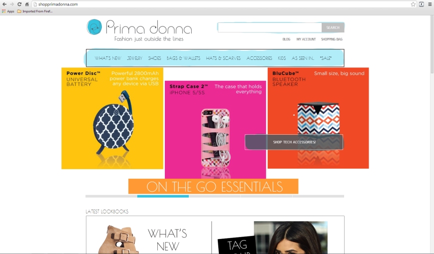
I went back and had another look at this page. After a long time I finally worked out that I can click on this bizarre box. I only worked this out because I accidentally rolled over it with the mouse and it changed colour. So I click on it expecting to be taken to a page showing just these five pieces. Nope! I’m taken to a page that contains five whole pages of random pieces. I had to scroll for an eternity to find it.

http://shopprimadonna.com/
Here the colours used are really bright. Normally I’d like this type of thing but here it just looks bizarre and squashed.
http://shopprimadonna.com/
Here is another screen shot of the slide show on the home page. The grey box looks uncomfortable on the page. I tried to read the information. I was genuinely interested but the next slide appeared before I was even half way through! Again feelings of irritation and annoyance.

http://shopprimadonna.com/
Conclusion
Design and arrangement of websites is down to opinion in some respects. Some people may find this design is fine for them but I didn’t. I really don’t think it’s too much to ask, especially on a shopping site, that I can get to the items easily, without the need for having to guess what category pieces may or may not belong to, or scrolling for a very long time just to find one thing. It just seemed like such a shame since the accessories are so pretty. Putting a lot of information on a slide show just isn’t viable. Always make sure elements have enough breathing room.
Apart from these problems the rest of the site looks great in my opinion. They’ve used a nice modern typeface and the colour scheme is fresh. The menu looks fine. They do use a lot of white space around their pieces which looks nice. You can zoom in on pieces effectively so you can see them clearly. Nice search box at the top.
Its been very interesting looking at this site and I feel I’ve learnt a lot about the importance of intuitive design and convenience.
