fltdsgn.com recognises Treehouse’s web site design as flat. I thought I should look up the trend and find out who popularised it.

http://www.awwwards.com/flat-design-an-in-depth-look.html
Windows 8
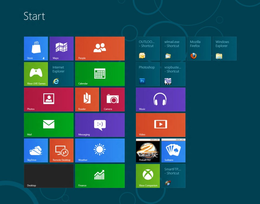
http://early-adopter.com/wp-content/uploads/2013/08/windows-8-flat-design.jpg
I chose not to block ads since I want to become a graphic designer, I need to know what ads look like since I might end up designing them one day. The ad for treehouse caught my attention. I thought it looked different to other ads. It had a charming quality about it that drew me to it. It looks modern and friendly. I saw these adds on various sites. I haven’t given a link since the adds rotate so I can’t guarantee when they will appear.
The following images are from http://blog.teamtreehouse.com/ and https://teamtreehouse.com/
Conclusion
It’s hard to remember what all these icons mean without going back to the treehouse website to look them up. They aren’t self-explanatory and I don’t use treehouse so I haven’t seen them regularly to be able to recite their meaning. They obviously serve their purpose on the website though. I think the reason they have so many icons is because they have a lot of different courses. They don’t seem to want to show any of the course content so they show a symbol or icon instead. The colours are slightly dusky. It certainly brightens up the website and without them much of the site would be just text. They break up the page. I’m not sure how useful this will be for my current project but you never know.


